Truth be known, I have always been a bit afraid of being bold with colour on the walls of my home but I do love colour and have always found it easier to add colour with accessories. That explains my love of cushions! Even so, there are some of you who feel stuck even with injecting smaller bits of colour into your home, so here are some pointers that you might find useful.
1. What colours are you drawn to?
What colours do you really love? Think about specific places, memories or even people and see if anything springs to mind. Thinking about her love of green has given me an appreciation of the colour that I never had before and consequently, there's now more green in our house. My friend Martha from the Colourfile loves sunrises and painted her whole kitchen with those colours in mind - check her Insta out here. One great piece of advice I once heard (and I wish I could remember who said it!) was to look at your wardrobe and notice the colours you wear. For me, that's lots of blues and pinks in different tones and surprise, surprise, there's a fair bit of that in our home too.
2. In common and...in contrast
Firstly, pick one or two colours in common with your favourite colour that aren't competing for its attention. Neutrals are great for this. I've done this with quite a few of my cushion covers by printing on to a natural linen colour, for example
pink clover or
spotty ticking.
The neutral background softens the overall look, still adds to your colour palette and grounds everything nicely. Secondly, you need some contrasting accents that add a bit of punch to the scheme and they also tend to do a great job of bringing out the other colours you've chosen. I quite like navy blue but it's very boring if you don't add in some other accents. I think cobalt, hot pink and bright yellow are great at doing this. I've added those colours as accents in some of my cushion covers as they do really elevate things, like our best-selling
green droplet with its pink piping.
3. Proportion (again!)
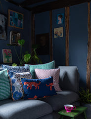
Following on from my previous post on using proportion with pattern, we have the same idea with colour. The proportion you use each colour with can really shift the mood. For example, if you love dark blue and you paint the walls dark blue and have other dark blue furnishings, the room is going to feel quite dramatic. However, if you switch to neutral walls, perhaps have an orange sofa and then have a variety of blue-toned cushions (including navy) it's probably going to feel a bit a bit more cheerful. Have a look at the image below; the dark tones are in dominant proportions i.e. dark walls and dark sofa, so it feels quite dramatic and moody. The colourful accents in the cushions and teacup give more depth, and even if one colour dominates the proportion of your colour scheme, you do need even the tiniest of accents for a bit of balance and so that the room doesn't look completely flat.
And here's Annalise's house (you can find here here on
Insta). She's got a beautiful green colour on the walls which is actually quite dark but...she's got a more neutral sofa, rocking chair, fireplace and floor coverings which make it brighter, rather than quite so moody.
I hope this is helpful and gives you more confidence with colour. Please email me at hello@kittyholmes.com if you need any more help with adding some colour to your home.


Leave a comment